Tuesday 30 November 2010

Swing Tags


Decided to use just the symbol and Marvel logo on the tags because the illustration it's self is on the t-shirt and therefore it doesn't need to be on the swing tag as well. Another good reason for using the symbol is that it can be interchangeable with other team symbols. (which will be on my proposal board)

Now all I have to do is print these, get some black and yellow ribbon and attach it.

Tag's


Tag's both black and yellow for the t-shirts. Going to print these out and ask which ones are working/which one will set of the t-shirts right. I'm also thinking of making some round ones.

'Locke Girl Fit


Black:


Yellow:

Took some shots of the girls fit top in the tutorial room (as studio 3 was in use). The yellow fits a bit tight so I didn't want to subject anyone else to it. Forgot the comic book with 'Locke on the front that I wanted to shoot with but there's always later. When Jonny get's in I'll be taking pic's of the guy fit ones.

Monday 29 November 2010

Screen Printed T-shirts!


Girls black top:


Girls yellow top:


Annnnd the rest:

The reasons these did not turn out as good as the others is because of the matte lacquer I was using. Had to use that because of the light colour on dark fabric but with each run it was coating the screen in a film. But that's ok, the other two turned out great and now I know where I went wrong.

T-shirt Mock Ups

Just some mock up of the 'Locke t-shirt while my screen drys. Then I can expose it and screen print away.


Sunday 28 November 2010

Marvel T-shirt: Anole

"Anole. It's a type of lizard. Don't give me grief there are worse X-men code names."


Marvel T-shirt: 'Locke

Warlock from the New Mutants for my marvel t-shirt brief. This is the one I'm going to be screen printing tomorrow (if everything goes well) and then I'll have 3 other characters for the range.
Original terrifying sketch.

Cleaned up sketch.

Not quite sure what I was doing here but this was not the route I wanted to go down.
Thought I would try and rectify the problem with circuity but it just made him look like predator alien.

inverting the colours didn't work either.
So, I went back to the cleaned up sketched and decided to actually make this a decent piece of line art and I think it paid off. The great thing about this character is that he's so versatile and there are many different alterations of him.
Tried to work in a quote but it just wasn't sitting right.
Neither was the speech bubble so I scrapped the speech bubble idea and quote all together.
Decided to go for an all over pattern that shows what team the character is from.

The coulours is will be on the t-shirt. I think this will work for n affective t-shirt.

This is the character that will be screen printed. The other characters in the rage are Anole (x-men), Nightcrawler (x-men) Wiccan (Young Avengers)

Thursday 25 November 2010

Bunny Cards

Decided to make a range for my cupcake cards and ended up with a rather sad looking bunny rabbit. I'm not used to drawing "cute".


Marvel T-shirt Worries

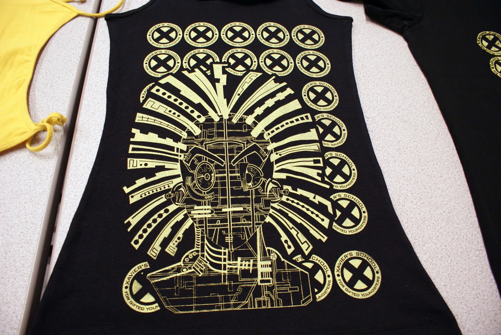
Earlier today I was fretting about my Marvel t-shirt brief. How it was not going the way I had planned and I wanted to change my initial idea. Which is a pretty silly thing to do with only 3 weeks left.

I was too focused on trying to make the girl t-shirts different from the ones already out there. I wanted to put across that girls could be just as good as the guys in the terms of t-shirt design but I saw that I was doing the exact same thing as the official marvel t-shirt produces and was treating girl readers separately instead of the same.

So, my idea has not changed and neither has my designs. However, I am now going to make the t-shirts unisex and so it becomes less about gender and more about what it should be all along; the comics and the designs.

Gender should never have been the issue. It's about how I can get BOTH (and those that fall in between) to be able to wear the same designs without it being to feminine or too masculine. Minus stars and sparkles.

Thank you Carl for setting me on the straight and narrow.

Q& A from Show and Tell

Questions:

  1. Are the images strong and well place on "The Outsider" - What suggestions could you make to improve this brief?
  2. What range could you suggest for the cupcake cares - could they be used as a set?
  3. Have a hard time trying to put the Marvel Brief into context. Could you suggest other ranges?
  4. The box for the Marvel books - How does the type sit and can this be improved? How about the images, would other characters sits better?

Answers:

Correlated and how to take on board the answers:

Tuesday 23 November 2010

The Outsider

Ok, so they're not the A2 prints. They're in my draw laying flat as not to curl in on themselves anymore. Once they're flat and trimmed, I'll have pictures for the blog. Until then, the a3 print out's will suffice.


Oh, and I also decided the make some book marks for this brief as it felt appropriate.