
I chose to work with Robot movies for the 5 x 10 second idents because it's a genre I've been into since I was little, even before comic books. I found the technology and their almost logical way of thinking fascinating, as well as their overall designs.
I started by looking into the history of robot's; who came up with the term 'robot' and where it originated from. I also looked into how robot's have been portrayed over the years, depending which era/audience they where being created for. The movies that I started to look at where; The Hitchikers Guide to the Galaxy, Bladerunner, Robocop, Futurama: Benders big Score and finally Wall-E. (Not all of the films where directly robot films, but had semi-main characters that were.)
I started by looking at the designs of the characters. One side of the robots were sleek and simple looking (Marvin) Yet others where bulky (Bender, Wall-E). I started focusing on the components that actually make up a robot like gears, cogs, circuit boards and (usually) electricity. I decided on very clean looking idents with only the hint of brushed metal in the illustrations. This was to show the different sides of robots. I also wanted different idents that still worked as a set. For example, two would have used the circuit board motif and two would use gears, cogs ect. The last one would have combined the both.
This project allowed us to look into new software such as After Effects and DVD studio pro. I really struggled with Afters effects and simply couldn't get my head wrapped around the program. I think if I was allowed to explore the program with out knowing I had to make animations for the overall module then I would have been happier looking into it. However, once I was talked through the program I knew I what I wanted to do was not as hard as I had first envisioned.
As I felt that my idents where lacking in technical competence, I wanted to focus my design skills on the DVD. I don't think I did it much justice though and looking back at the DVD, I wish I had spent more time on it and developed more designs for it instead of making just one and sticking with it. Due to not knowing that DVD studio Pro would cause slight pixelation, I started making DVD menu's that couldn't actually be read on screen. If I had explored the program a little earlier then I would have made amendments.
Overall, I’m ok with how the DVD turned out; I didn’t think it was too bad for a first attempt. I should have left myself more time to properly work on the packaging of my DVD. The design works because it's kept in context with the idnents but I don't feel the overall look really worked. I should have left time for exploration with tin boxes that I was thinking of looking into.
I feel that I have learned a lot during this module, however, I also know that it has helped me to realise that while I like motion Graphics and the deign for it, putting it together is not my forte. I'd rather be able to design the animation and hand it over to someone else.
What I would do differently next time:
1. If I know that I can't work very well with the program, then to focus more energy on the story boards.
2. Leave myself more time to work on the packaging.
3. Learn to be more selective with my work when it comes to the DVD content.
4. Be more critical about my work.
5. Not to worry so much about the overall look of my idents, it wasn't the major part of the grade.
Showing posts with label OUGD202. Show all posts
Showing posts with label OUGD202. Show all posts
Saturday, 13 February 2010

Friday, 12 February 2010
Images Problems
(Edit, turns out it's only the college computers doing this...we're fine.)
Oh blogger. Why choose deadline day to refuse to display any ones images?
I'm going to do my best tonight and try and re upload the missing images. But so far, I think it's only happening on Mac computers because my PC showed them up fine last night. However, a lot can happen in six hours when you sleep. So, sorry for the massive white space where images should be, I'll try and do my best.
Also apparently having spider man covers is classed as adult content by Leeds college of art and design. That'll teach me for taking picture of development work on my bed.
Oh blogger. Why choose deadline day to refuse to display any ones images?
I'm going to do my best tonight and try and re upload the missing images. But so far, I think it's only happening on Mac computers because my PC showed them up fine last night. However, a lot can happen in six hours when you sleep. So, sorry for the massive white space where images should be, I'll try and do my best.
Also apparently having spider man covers is classed as adult content by Leeds college of art and design. That'll teach me for taking picture of development work on my bed.
Thursday, 11 February 2010
DVD Design
Here are a few designs I've been working on for my DVD. I wanted to keep them simple, like my menu's and to tie in with the overall feel of the idents.

(Which I have only just realised is the wrong way round!)
Design 2:
 And now it's the right way round...
 I think this is my favourite one at the moment. I like the idea of having screen grabs on the back of the case to show the actual DVD content.
 I'm going to print out this one and design 3 to see what they look like in the DVD case.
More to come and them I'm going to choose the one I think is most affective.
Design 1:

(Which I have only just realised is the wrong way round!)
Design 2:
 And now it's the right way round...
Design 3:
 I think this is my favourite one at the moment. I like the idea of having screen grabs on the back of the case to show the actual DVD content.
 Design 4:
 I'm going to print out this one and design 3 to see what they look like in the DVD case.
 More to come and them I'm going to choose the one I think is most affective.
Tuesday, 9 February 2010
DVD Studio
Just to show how my DVD is coming along. It's easier to put together than I thought it would be. The History Menu won't actually have any text on it when the DVD is burned to disc, but it was have a link to my blog. (This will be the same for other menus.)


Monday, 8 February 2010
DVD Problem Solution!
Ok, so my plan was to have menu's on my DVD with text information about certain icons in robot history. However...when I put all this in DVD studio Pro the results were far from perfect. The resolution for the DVD is not very high, it pixelates and this doesn't help with pieces of text at a small size.
Then Menu's themselves are still going to be on the DVD, but I'm re directing here:
History Of Robots:

Issac Asimov:

Then Menu's themselves are still going to be on the DVD, but I'm re directing here:
History Of Robots:

Issac Asimov:

There's some more to come...
Saturday, 6 February 2010
Do you want me to sit in the corner and rust, or just fall apart where I'm standing?
Marvin Again:
Changed the music from Pendulum to Saberpulse and slowed down when it run's over the text.
Changed the music from Pendulum to Saberpulse and slowed down when it run's over the text.
Roy~
I left Roy (Blade-Runner) until last because i was trying to vector him but gave up in the end. However, I feel as having a still from the film actually works better.
Roy Test 1:
Roy Test 2:
I still thinks it's too fast for any one to humanly read and I'm going to try and work on that.
Almost Final:
I used the same music from the Marvin Ident (As this was first chosen for Roy). The Marvin one doesn't really work with that music and it needs tweaking ever so slightly.
Friday, 5 February 2010
Almost Final
Here are 4 out of 5 almost final idents. I have to re work the Roy (Blade-runner) one as well as re make the art work for it but that shouldn't take me too long. Overall I think I could have done better if I had gotten to grips with After Effects a little more. It's taken until this week to really figure out just how it works. (For weeks I was sat there trying to make sense of the program until I realised lots of hard maths was involved and gave up trying. Magic, that's how the program works.) And for some reason Youtube likes to cut off the endings t my video's but the quick time movies are perfect.
Film: Hitchhiker's Guide to the Galaxy
Character: Marvin The Paranoid Android
Music: Pendulum; Spiral
This idents needs to be tweaked just a little bit, I'm not to happy about one or two of the revealing circuit boards.
Film: Robo-Cop
Character: Officer Alex J Murphy
Music: Daft Ounk ft Queen; We Will Robot Rock You
Film: Futurama: Bender's Big Score
Character: Bender Bending Rodriguez unit 22
Music: Mad Capsule Markets; Scary - Delete Streamin' Frequency
WALL.E:
Film: Wall.E
Character: Wall.E (Waste Allocation Load Lifter-Earth-class.)
Music: Saber Pulse; Light Speed Disco
Marvin:
Film: Hitchhiker's Guide to the Galaxy
Character: Marvin The Paranoid Android
Music: Pendulum; Spiral
This idents needs to be tweaked just a little bit, I'm not to happy about one or two of the revealing circuit boards.
Murphy:
Film: Robo-Cop
Character: Officer Alex J Murphy
Music: Daft Ounk ft Queen; We Will Robot Rock You
It was suggested in my final crit that I should inverse the colours and for this Idents I really think it works well. What I originally wanted where for the words to reveal themselves as the camera panned along the image.
Bender:
Film: Futurama: Bender's Big Score
Character: Bender Bending Rodriguez unit 22
Music: Mad Capsule Markets; Scary - Delete Streamin' Frequency
WALL.E:
Film: Wall.E
Character: Wall.E (Waste Allocation Load Lifter-Earth-class.)
Music: Saber Pulse; Light Speed Disco
This one is actually my favorite one. I changed the colour to suit the character as well as the mood of the film. I wanted it to be very light and happy as apposed to the other robots who are either depressed/emotionless/homicidal...or Bender.
Tuesday, 2 February 2010
5 Questions
Five questions for the final crit tomorrow that goes with the post just below this.
1. Should I try and animate individual pieces of the of idents, say the text for example? (Another idea is have the image turn upwards and then back showing a different direction.)
2. Does the white background work or does it need somthing more solid to help them stand out?
3. Are the audio piece (Context blog) relevant or are their other alternatives that could be suggested?
4. Are the simple colours affective, can you tell it has a metal brushed effect? (Gold with the Wall-E one?)
5. Should I bring more colour into my DVD and have an illustrative collecting of robots at the beginning?
1. Should I try and animate individual pieces of the of idents, say the text for example? (Another idea is have the image turn upwards and then back showing a different direction.)
2. Does the white background work or does it need somthing more solid to help them stand out?
3. Are the audio piece (Context blog) relevant or are their other alternatives that could be suggested?
4. Are the simple colours affective, can you tell it has a metal brushed effect? (Gold with the Wall-E one?)
5. Should I bring more colour into my DVD and have an illustrative collecting of robots at the beginning?
Final Crit
Ident Story Boards:
Marvin:

 Murphy: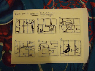
Marvin:

 Murphy:
Roy:
Bender: 

Wall-E:
Animation strips:

Murphy:
Roy:
Bender:
Wall-E: (I've only just realised the Wall-E one doesn't have any quotes....)
From last weeks crit I took on board the suggestion that the story boards looked a little dark and "dirty" on account of the burnt metal effect. I've now only limited this to the circuit board/cog effects but I'm unsure about the white back grounds. The other problem I've had is using vectored images of the characters. This has worked well for Marvin, Bender and Wall-E but not so well for the human looking robots. Murphy's design is quite simple to vector but Roy (blade runner) no so much, so I need to work on him.
Murphy:
The problem I'm having with my idents is that they are starting to look samey. I wanted to keep them clean and almost clinical looking after the crit last week but they're starting to border on lazy looking? (This one also ran on longer than it should have done and has cut the last half a second or so off so you don't see the Sci Fi logo. This will be fixed when it comes to showing my finals.)
 The design direction for my DVD has not altered much. I wanted to keep it within the running theme of my idents i.e white back ground with grey text and image ext. The DVD itself has taken up more time than my idents which is not exactly a bad thing as I have liked making the DVD more the idents them selves. (I've liked designing them, but not trying to make them work.)


 There will be more test pieces than that and they will be named appropriately but this is just to show what the design interface of the DVD will look like. Some of the menu's will take you to image files that can be scrolled through such as the story board menu's.


Marvin:

Murphy:

Roy:

Bender:

Wall-E:
 (I've only just realised the Wall-E one doesn't have any quotes....)
From last weeks crit I took on board the suggestion that the story boards looked a little dark and "dirty" on account of the burnt metal effect. I've now only limited this to the circuit board/cog effects but I'm unsure about the white back grounds. The other problem I've had is using vectored images of the characters. This has worked well for Marvin, Bender and Wall-E but not so well for the human looking robots. Murphy's design is quite simple to vector but Roy (blade runner) no so much, so I need to work on him.
Test Idents:
Marvin:
Test piece without the audio file. I wanted it to slow down over the words to give the viewer a chance to read them as there are no quotation clips for the idents. I decided not to put them in and focus solely upon the music score. I though this would be more affective, giving the idents a more ambient feel.
Marvin:
Test piece without the audio file. I wanted it to slow down over the words to give the viewer a chance to read them as there are no quotation clips for the idents. I decided not to put them in and focus solely upon the music score. I though this would be more affective, giving the idents a more ambient feel.
Murphy:
The problem I'm having with my idents is that they are starting to look samey. I wanted to keep them clean and almost clinical looking after the crit last week but they're starting to border on lazy looking? (This one also ran on longer than it should have done and has cut the last half a second or so off so you don't see the Sci Fi logo. This will be fixed when it comes to showing my finals.)
DVD design pieces/boards: (to be added)
DVD interface design:
 The design direction for my DVD has not altered much. I wanted to keep it within the running theme of my idents i.e white back ground with grey text and image ext. The DVD itself has taken up more time than my idents which is not exactly a bad thing as I have liked making the DVD more the idents them selves. (I've liked designing them, but not trying to make them work.)
 Main Menu:

With the select buttons which I have forgotten to add on the one's below. (Which will be rectified other wise no one will be able to use the DVD)
Silent Movie:  Movie Season:
 Movie Season:


(When I started to realise that I needed the selection buttons underneath)
 There will be more test pieces than that and they will be named appropriately but this is just to show what the design interface of the DVD will look like. Some of the menu's will take you to image files that can be scrolled through such as the story board menu's.
 And some will take you to info screens like the one's below which are incorporated into design rather than just a text file:


Tuesday, 26 January 2010
And More Schematics
I don't even know if that word is spelt right any more. Anyhow, here is the revised schematic for the DVD.

Revised:
I'm going to do up on the computer as well so it makes more sense with the added back buttons. I'm still not quite sure if this is EVERYTHING that needs to put on the DVD but if it's not, it'll come to me. Probably in a nightmare where a giant DVD is chasing me.

Rough Copy:

Revised:

I'm going to do up on the computer as well so it makes more sense with the added back buttons. I'm still not quite sure if this is EVERYTHING that needs to put on the DVD but if it's not, it'll come to me. Probably in a nightmare where a giant DVD is chasing me.
Digital Version: (Still needs back buttons)

DVD Sub Menu: Design Direction
Movie Season > Design Direction > Story Boards > Draft story boards (Image files that run through all 5 draft story boards)
> Post Cards (Image files that run through the 5x6 story board a6 post cards)
> Illustrations > (Image file of everything I've drawn for this brief)
(This is for my own state of mind as not to get too confused, because I know I will)
Movie Season > Design Direction:
Movie Season > Design Direction > Story Boards:
 Which will lead into the drafts and the a6 post cards. Image files that can be flicked through.
> Post Cards (Image files that run through the 5x6 story board a6 post cards)
> Illustrations > (Image file of everything I've drawn for this brief)
(This is for my own state of mind as not to get too confused, because I know I will)
Movie Season > Design Direction:

Movie Season > Design Direction > Story Boards:
 Which will lead into the drafts and the a6 post cards. Image files that can be flicked through.
The illustrations will also open into a selection of image files of all the illustrations I've done for the Movie Season.
DVD Sub Menu: Research
Ok, here is where I'm going to start getting confused if I don't post these and leave them sat on my hard drive. There are allot of sub category's for the DVD. (I'll need to change the schematic to show the changes)These are the sub Menu's for the Movie Season.


Decided to write out the history in Futura because a smaller condensed comic age get's ineligible after a while. It also ties in with the theme.

I'm going to make a profile/reference sheet for each character that is featured in the Idents. This will include name, film ect.

A small bio of the man who coined the 3 laws of robotics, which has been used many times in robot films.
Main Menu > Movie Season > Research:

Main Menu > Movie Season > Research > History Of Robots In Cinema:

Decided to write out the history in Futura because a smaller condensed comic age get's ineligible after a while. It also ties in with the theme.
Main Menu > Movie Season > Research > Robot Character Profiles:

I'm going to make a profile/reference sheet for each character that is featured in the Idents. This will include name, film ect.
Main Menu > Movie Season > Research > Isac Asimov:

A small bio of the man who coined the 3 laws of robotics, which has been used many times in robot films.
DVD Menu Mock Up's
Here are 3 mock up menu's for my DVD. They're not yet finalised and I'm yet to do the sub sections but this is roughly want I want to achieve. Within the menu's I need to put information about each brief, not just the module information on the front page. For a mock up, I don't think I did too badly but there are still bits that need tweaking.

Silent Movie:
Movie Season:
Sub menu's need to be designed, as well as the overall look for the DVD. The indents them selves have a slight burnt/metal effects. I'm not sure whether I want to do this for my DVD or not, but I don't want them to look Exact.
Main Menu:

Silent Movie:

Movie Season:

Sub menu's need to be designed, as well as the overall look for the DVD. The indents them selves have a slight burnt/metal effects. I'm not sure whether I want to do this for my DVD or not, but I don't want them to look Exact.
Thursday, 21 January 2010
Revised Story Boards
Revised story boards from feed back gained in the crit. (Picture to be uploaded)
Wednesday, 20 January 2010
Crit Feed Back
Ok so I got some good feedback from the crit today regarding my idents. I'm not very good at reading joined up writing, so I'm going o try and type out the best I can. Then I don't have to sit and scowl at the paper every time I read it.
Strengths:
Strengths:
- Design Direction: Suitable to the channel of choice. A clear audience. Could see this working on the sci fi channel. Definite theme running through out them, all fit together as a set.
- Design Development: Nice sketches and drawn story boards. Nice evenly weighted schematic. Cog shapes (bender) are really working. Very nice drawings, wide range of films and genres within the theme.
- Visual Quality: Nice burnt metal effect. Clean simple cog one. I know what I'm doing with the software.
- Technical Competence: Good technical drawing of circuits ect. Good quality of line in characters.
- Design Direction: Explore colour and maybe typeface? Look at how actual film robots have been designed - can you incorporate that. limited imagery.
- Design Development: Look into colour and type. Look into your circuit board line animating to create characters. Colour.
- Visual Quality: Is it a series or is it separate sequences? They look a little "dirty".
- Technical Competence: line weight of characters should probably be same weight as circuit for consistency.
- Chop the cogs out of metallic texture, image mask it. This would fit in nicely with the rest of them.
- Look at Haynes car Manuel. Animate a technical drawing for each characters- label ect. Also Exploded views.
- Look into faux data visuals, make up a set of specs for each robot.
- How are they going to move?
- Are they going to pan across the screen?
- Like the Bender One. Nice and Clean - Think it works! Like the cog idea of the cogs turning.
- Should try jumping out of my comfort zone (?)
Tuesday, 19 January 2010
Digtial Roughs
They're still not finalised yet but here are the five digitilsed ident story boards that I've been working on for the crit on wednesday:
1. Marvin; The Hitch-hikers Guide To The Galaxy: "Life, Don't Talk To Me About Life" :
 2. Murphy; Robocop: "Dead or alive, you're coming with me":
 3. Roy Batty; Blade Runner: "All these moment will be lost in time ... Time to die."
 5. Bender; Futurama: "Well...We're Boned." :

1. Marvin; The Hitch-hikers Guide To The Galaxy: "Life, Don't Talk To Me About Life" :
 2. Murphy; Robocop: "Dead or alive, you're coming with me":
 3. Roy Batty; Blade Runner: "All these moment will be lost in time ... Time to die."
 5. Bender; Futurama: "Well...We're Boned." :
Monday, 18 January 2010
Rough Story Boards
Rough/Draft Story Boards I've been working on for the idents. (Pictures to come as I don't have a working camera at the mo)
Saturday, 16 January 2010
Cybernetic Icons
So far I've only managed to make one. This is time consuming and a little bit boring. But then again, vectoring always has been. I find this kind of illustrating restricting and very...straight. (despite the obvious circle). But I am determined to carry on and get them finished because they're not so bad looking.

I suddenly feel like reading Iron Man. Bring on the sarcastic alcoholic.
 I can't let you do that Dave. He counts as a robot to, didn't actaully see the similarities until now.

I now have a really good idea for my five idents. I just have to get the rough drafts down before I make anything of it.

I suddenly feel like reading Iron Man. Bring on the sarcastic alcoholic.
 I can't let you do that Dave. He counts as a robot to, didn't actaully see the similarities until now.
I now have a really good idea for my five idents. I just have to get the rough drafts down before I make anything of it.
Subscribe to:
Posts (Atom)
