
Questions for the crit:
1. Do you think that the briefs I have outlined so far reflect my rational and inform/relate to my current design practice?
2. Is the November in the North brief a substantial amount of work taking into consideration that it is a 12 page comic not including a front cover. Is there any way I could possibly expand this brief? (The competition deadline was last week; I am now solely focusing on the comic for myself.)
3. What do you think of my type and layout choices for The Stranger brief? Is there anyway this could be improved without completely redesigning the cover or taking away from the initial concept?
Wednesday, 20 October 2010

The Stranger: Cover 2
 This is almost complete as far as a book cover design goes. There are a few things that need tweaking here and there but that's what the crits tomorrow are for. The idea to have it gray scale is because of the novel itself. Life/people are not entirely black and white. There is not a totally morally good person and yet people feel this way. Meursault see's himself as neither good or bad, he just exists. Therefore, he is the gray are represented in the smoke.
Meursault Head
 Added in the shadows and made the hair a little longer to correspond with the image on the back of the cover.
Meursault

Image for the back of The Stranger book cover. I'm only thinking of making it one of the 3 illustrations that also have to submitted along side the cover. Tried to dress him in appropriate 1940's style clothing. Braces!

The Stranger
My stranger brief is turning out to be a very quick turn around brief. After divering yesterday and worrying about not being able to illustrate what I could see in my head, Jonny offered to be a reference for me.

 Unpolished illustration. A few minor details missing but I quite liked the mood of the character. Meursault himself is unfeeling, uncaring and rather likens himself to that of the universe. That it simply doesn't care about humanity and we're only here for the ride. What annoys Meursault in the end is that people are so angry at him and his lack of empathy when it fact the universe has been doing that to them for century's.
 A bit more detail here. I think I'm going to re draw his clothing entire because at the moment he doesn't scream the 1940's at me. But this is a minor thing that I can re adjust today.
 Took just the image of the head to see what I could do it and rather liked the idea of smoke forming a question mark around Meursault. This idea that as a stranger/outsider he is questioned by society itself. In turn, Meursault questions them in a brilliant fit of rage at the end of the novel.
 Playing around with the book cover design. Completely influenced my DMZ and general Brian Wood at the moment.
 With the first unpolished illustration.
 Trying to play around with inverted colours. Not quite sure if this effective of not. I think it now looks to much like a photograph and not an illustration.
 Working with textures over the illustration and the start of figuring out the layout for the blurb. The idea being that I would have a smaller illustration of Meursault at the bottom.
 And with the head shot and smoke. I quite like this one.

With Meursault on the back cover in more traditional 1940's era clothing (which was influenced by the gangster culture at the time.)

 Unpolished illustration. A few minor details missing but I quite liked the mood of the character. Meursault himself is unfeeling, uncaring and rather likens himself to that of the universe. That it simply doesn't care about humanity and we're only here for the ride. What annoys Meursault in the end is that people are so angry at him and his lack of empathy when it fact the universe has been doing that to them for century's.
 A bit more detail here. I think I'm going to re draw his clothing entire because at the moment he doesn't scream the 1940's at me. But this is a minor thing that I can re adjust today.
 Took just the image of the head to see what I could do it and rather liked the idea of smoke forming a question mark around Meursault. This idea that as a stranger/outsider he is questioned by society itself. In turn, Meursault questions them in a brilliant fit of rage at the end of the novel.
 Playing around with the book cover design. Completely influenced my DMZ and general Brian Wood at the moment.
 With the first unpolished illustration.
 Trying to play around with inverted colours. Not quite sure if this effective of not. I think it now looks to much like a photograph and not an illustration.
 Working with textures over the illustration and the start of figuring out the layout for the blurb. The idea being that I would have a smaller illustration of Meursault at the bottom.
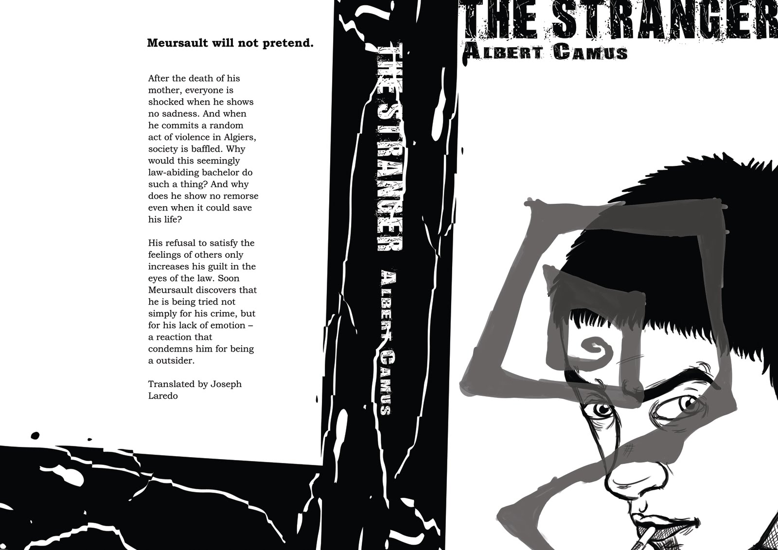 And with the head shot and smoke. I quite like this one.
With Meursault on the back cover in more traditional 1940's era clothing (which was influenced by the gangster culture at the time.)
Friday, 15 October 2010
Rough Lines
The (larger than average man) thumbnails I did for the comic has helped with the placing of the rough lines. (And also where everything fits inside the comic) Obviously, page 2 won't be printed next to page 3 due to duplex but it helps in the initial stages.
I'll be uploading these one by one as I do them. Rough lines and they're subject to change.
 Page 2 and 3. 3 being blank as the reverse is the front cover.
I'll be uploading these one by one as I do them. Rough lines and they're subject to change.
 Page 2 and 3. 3 being blank as the reverse is the front cover.
 Updated Scipt/next panels


 Updated/finished script for the 12 page comic (or 13 due to the DPS) as well as panels August - December.

 Brian dressed as Colin Morgan's Merlin and Leeland as an X-man. Because it's Halloween and I can get away with that.
 Adapted November page
 Calvin and Hobbes reference and I thought it would be an interesting way of ending the comic.
 Print Out
 Printed out my November page down in the print room this morning. It's printed on a poster paper (matte) type stock and it's turned out really well.


Thursday, 14 October 2010
12 Page comic


Draft layouts for my 12 page comic "November in the North" depicting a year in the life of two students, Brian and Leeland. (I say 12 pages, one of them is a DP spread in the middle of the comic.)
The layouts are very rough and slightly crude. They're just to help me plan out for the the roughs and the clean lines.
January - July


Script (so far) :
 More months/layouts to come.
Wednesday, 13 October 2010
Legible

So I re submitted my competition entry. Why? Well, after I had uploaded it to my Facebook, Sam Jhonson (who writes Geek Girl comic) commented that the text would look better stripped back and made black and white. I started to get a little worried because I had already submitted it and when I asked around the studio the response was the same as Sams.
I have never edited something so quickly in the my life.
It's not quite black and white but...It's better than what it was.
Hopefully no one will notice. *cough*
Subscribe to:
Posts (Atom)
